Graphic Design
- IDENTITY
- LOGOS AND MARKS
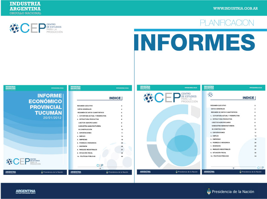
- EDITORIAL
- VIDEO
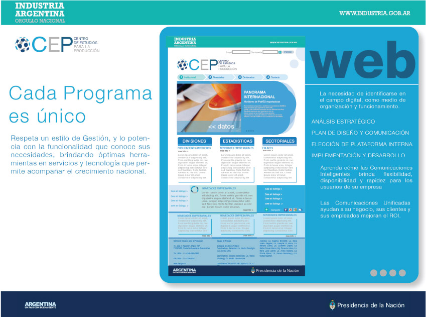
- WEB
- BRANDING
- CUSTOMERS
Artist
- ILUSTRATION
- ENGRAVINGS
- DRAWINGS
- INSTALLATION
- COLLECTIVE ARTS
- SCULTURE
- CERAMICS
- PAINTING
IDENTITY
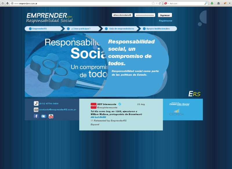
[ Visual Identity System | Updated Logo, Typography, Brand Guidelines, Color & Layout system. ]
Develop a communication plan in two big areas (inside and offside). These are demanding specially strategies. These have success with a coherence system.
The exploration of geometric architectural shapes and the materials of their own construction was the starting point for the creation of the visual identity.
Explored this idea through lines to represent the architectural projects and then becomes solid to represent the construction, in the sense of visually representing the brand philosophy, based on the development of projects that integrate all the services necessary to the development of all types of construction work. We developed a visual identity based on the infinite mutation of forms represented by solid lines, making a connection with the immensity of forms present in architecture and construction.